Showing posts with label GDP. Show all posts

Monday, May 3, 2010

Where do we stand?

Brad DeLong points out to a slightly different version of this chart
Always hard to fathom how the small looking drop on the chart threw millions out of their jobs. And while real GDP is almost back to its peak the Urate is still extremely high.

Thursday, September 17, 2009

V-Shape or Double Dip?

Paul Krugman illustrates very well why the risks of a double dip are real.
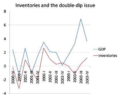
"There’s a tendency to treat worries about a double dip as outlandish, as something only crazy people like the people who, um, predicted the current crisis worry about. But there are some real reasons for concern. One is that the lift from fiscal stimulus will start to fade out in a couple of quarters. Another is that, as Yellen points out, most of the boost we’re getting now is tied to inventories. And that’s a one-time thing. You don’t have to look back very far to see just how transitory an inventory-led boost can be. The figure below shows growth before, during, and after the 2001 recession, together with the contribution of inventory changes to growth. Notice the boost from 2001IV to 2002I from inventories, then the fading out that almost, but not quite, turned into contraction later in 2002. It wasn’t literally a double-dip, W-shaped recession, but it came close.
Econbrowser more optimistically points towards Deutsche Bank's "credit impulse" indicator indicating a V-shape recovery. "Deleveraging implies slow growth in total credit, and according to the usual reasoning, slow growth in GDP. Several of Deutsche Bank's economists, however, focus on what they call the credit impulse. They provide the following provocative graph, which suggests a rapid recovery:"


Sunday, August 16, 2009

V-Shape

Here is a chart of YoY change in real GDP.
Since WW2 past episodes of ca -2.5% YoY change in real GDP have all been followed by a strong rebound, hence the usual V-Shape. Double dips are expceptional and muted rebounds inexistent.

Monday, August 3, 2009

Okun's Law Illustrated

Via Brad Delong (x-axis is 8 quarter average annual growth)

Thursday, July 2, 2009

V-Shape?

Econbrowser, as usual, has a very intersting post on inventory restocking. He doubts however that this will be sufficient to witness a strong recovery as "the question is whether our financial system is willing and able to extend the credit that would fuel the recovery. "

Saturday, April 25, 2009

China: Electricity Consumption and GDP growth

Floyd Norris posts the China's year-over-year increases in its gross domestic product and electricity consumption for the first quarter of each year.

2002: Electricity up 9.4%, G.D.P. up 8%
2003: Electricity up 14.7%, G.D.P. up 10.3%
2004: Electricity up 16.7%, G.D.P. up 9.8%
2005: Electricity up 14.3%, G.D.P. up 9.9%
2006: Electricity up 13.4%, G.D.P. up 10.4%
2007: Electricity up 12.4%, G.D.P. up 11.7%
2008: Electricity up 16%, G.D.P. up 10.6%

China Q1'09 GDP was up 6.1% YoY while in the first two months of the year electricity consumption was down over 9% from last year.

This reminds me of this story of provinces overstating their GDP estimates.

Thursday, April 23, 2009

Rainfall and GDP growth

From the economist's dailychart. Variability in rainfall explains why economies dependent on farming have more volatile gdp's. As the paper notes it seems however that some changes in GDP precede the ones in rainfalls. An other example of Cum Hoc Ergo Propter Hoc?

Monday, March 16, 2009

"What will recovery look like?"

Excellent post from James Hamilton at Econbrowser on "What will recovery look like?"
The post has interesting long term charts of some of the key components of GDP as well as the chart below which "averages" all post WWII recessions (ex the current one).


Average cumulative change in 100 times the natural log of real GDP or its respective component beginning from the business cycle peak for the 10 recessions between 1947 and 2001. Horizontal axis denotes quarters after the peak.

Prof Hamilton also shows the path of the current slump:

And compares it to the big 1981-82 recession:

At least he is mentioning recovery.

The Minneapolis Fed has a nice tool to compare recessions. You can find it here.

Monday, March 9, 2009

"First homes, then cars, and last business equipment"

CalculatedRisk created the following tables based on a paper by Prof Edward E. Leamer from UCLA tackling the temporal order of GDP components.

When Weakness Typically Starts

Pre-Recession Coincident with Recession Lags Start of Recession
Residential Investment PCE Investment, non-residential Structures
Investment, Equipment & Software
Unemployment

When Recovery Typically Starts

During Recession Lags End of Recession Significantly Lags End of Recession
Residential InvestmentInvestment, Equipment & Software Investment, non-residential Structures
PCEUnemployment(1)

CR quotes: "The first item to soften and the first to turn back up is residential investment. The temporal ordering of the spending weakness is: residential investment, consumer durables, consumer nondurables and consumer services before the recession, and then, once the recession officially commences, business spending on the short-lived assets, equipment and software, and, last, business spending on the long-lived assets. The ordering in the recovery is exactly the same."

Will homebuilding and retail be among the first sectors to recover from the current bear market?

Saturday, March 7, 2009

Saturday, January 17, 2009

Global recession?

So a global recession is a near certainty as mentionned as well by the president of the San Francisco fed in her Jan 15th speech.

Wikipedia has great infos on GDP:

The definition of GDP is here.

The list of countries by GDP (PPP) is here. World GDP was ca 65tn USD in 2007.

The list of countries by GDP (nominal) is here. On this measure world GDP was ca 55tn USD in 2007. A big part of the difference between the two measures is explained by the BRIC (Brazil, Russia, India, China). For example China's nominal GDP was 3.3tn USD while measured on a PPP basis its economy is much larger at 7tn USD.

The list of countries by GDP (PPP) per capita is here

The list of countries by GDP (nominal) per capita is here

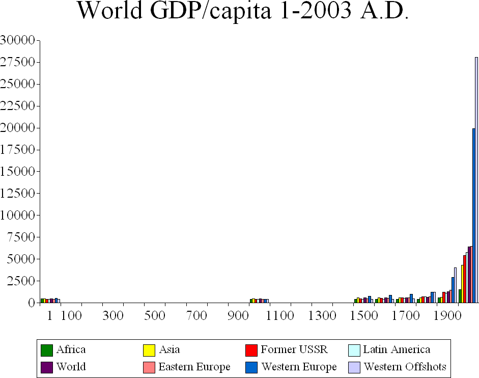
Finally this chart tells you what a revolution is really like.