Saturday, January 31, 2009

Long term growth

Here is an interesting chart on the long term growth in real per capita GDP, real stock price returns and real earnings taken from an article by Brad Cornell and Rob Arnott published in CFA Institute Magazine in Nov/Dec 2008. The authors mention that over the past 25, 50 and 100 years, annual real per capita GDP growth averaged 1.4%, 1.7% and 1.9% respectively.
Over the same periods real per share earnings grew 3.2%, 2.0% and 1.5% annually while the S&P500 increased by 5.1%, 2.7% and 1.9% per year above inflation. Very interesting to see how over the longest period (100 years) these measures grew at very similar paces.


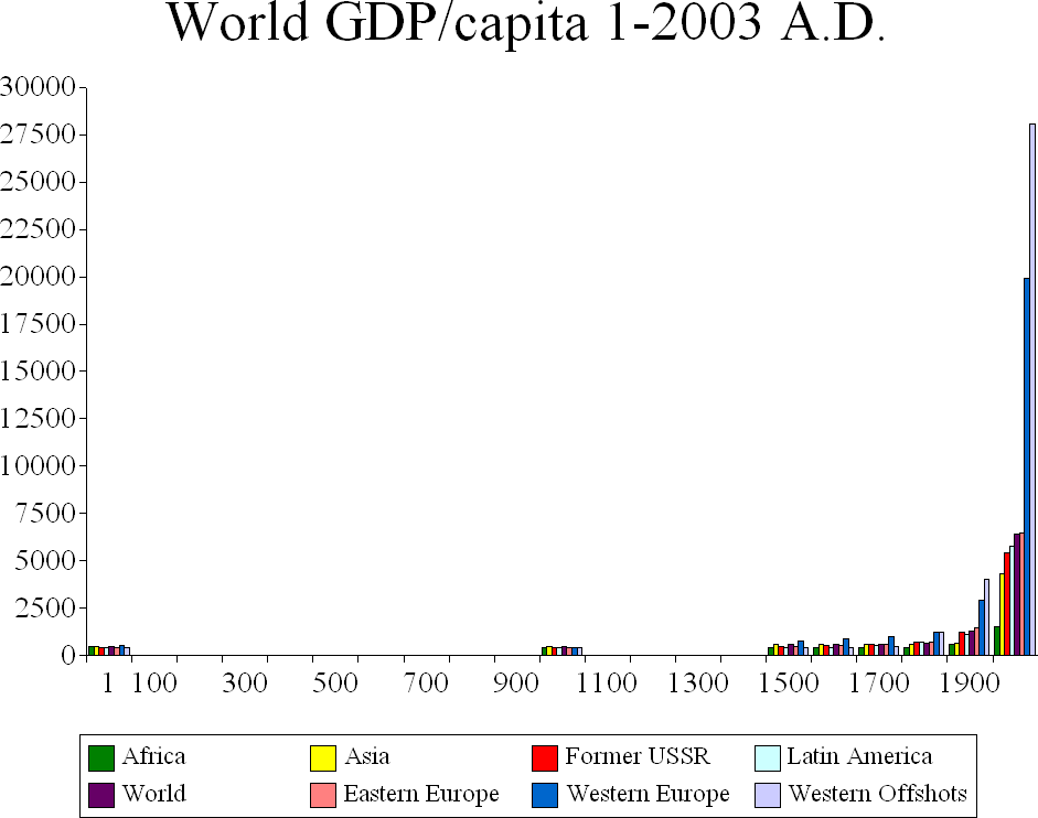
Brad DeLong has an excellent little paper on economic growth here. It shows that the numbers above are just so much larger than before the industrial revolution.

Sunday, January 25, 2009

Leverage

Found this chart from Ned Davis Research on the web. I find it very interesting as it goes back to the 20's while the flow of funds data provided by the FED used for many debt to gdp ratios only goes back to the 50's. How brutal will the current deleveraging be?

Friday, January 23, 2009

"The End of the Financial World as We Know It"

A famous investor recommends this NYT article. A great read indeed on the tyranny of the short term, moral hazard, the role played in the current crisis by rating agencies and regulators such as the S.E.C. I did not know that "The commission’s most recent director of enforcement is the general counsel at JPMorgan Chase; the enforcement chief before him became general counsel at Deutsche Bank; and one of his predecessors became a managing director for Credit Suisse before moving on to Morgan Stanley." The authors use great images:
On the suspension of "mark to market" accounting: "gorge yourself for months, but refuse to step on a scale, and maybe no one will realize you gained weight"
On credit-default swaps: "Call it insurance if you like, but it’s not the insurance most people know. It’s more like buying fire insurance on your neighbor’s house, possibly for many times the value of that house — from a company that probably doesn’t have any real ability to pay you if someone sets fire to the whole neighborhood."

Wednesday, January 21, 2009

US car sales are low

Calculated Risk has a great chart on the turnover ratio of the US car fleet. You obtain it by dividing the number of registered vehicles in the US by the annual sales rate. At the current sales rate of ca 10m units per year it would take 23.9 years to replace the fleet. Ever been to Cuba?


Banks' vanishing act

Great chart posted on FT Alphaville. The total market cap of the 15 banks charted below went from 1.7tn USD to 500bn from Q2'07 to Jan 20th 2009 in spite of numerous capital increases. More impressive visually!

Tuesday, January 20, 2009

Credit Losses

Via Calculated Risk quoting a Bloomberg article we learn that Prof Roubini now foresees 3.6tn USD US credit losses half of them by banks and broker dealers. Wikipedia has a list of writedowns due to the subrprime crisis here, close to 400 bn USD on that list alone already but it is global. Ouch!

Sunday, January 18, 2009

Time to buy a car?

The Economist has a nice briefing on the car industry. The basic problem is overcapacity: "CSM Worldwide, an automotive-market consultancy, estimates that the world could produce about 94m cars a year—about 34m more than it is buying. In North America alone, capacity exceeds demand by around 7m vehicles." How does bailout money help solve this problem?
Mr Marchione "believes that to have any chance of making money in the future, volume manufacturers will need to produce at least 5.5m cars a year". That's a lot of cars. According to Wikipedia in 2007 only four makers were above this threshold and three of them are currently making losses. See source data here.

Fortune ran an interesting piece on GM a while back. The chart below sums up the extent of the trouble well. Otherwise GM financials are here.


Econbrowser always does an excellent job tracking US auto sales. After such a dismal 2008 it will be interesting to see how 2009 compares.

Saturday, January 17, 2009

The Aftermath of Financial Crises

Very interesting paper by Carmen Reinhart and Kenneth Rogoff. The Economist has the key findings here. Looking at the table below it appears that the current correction in US Stock prices from their peak is now very close to the average change during severe financial crises. But it could last longer.


Global recession?

So a global recession is a near certainty as mentionned as well by the president of the San Francisco fed in her Jan 15th speech.

Wikipedia has great infos on GDP:

The definition of GDP is here.

The list of countries by GDP (PPP) is here. World GDP was ca 65tn USD in 2007.

The list of countries by GDP (nominal) is here. On this measure world GDP was ca 55tn USD in 2007. A big part of the difference between the two measures is explained by the BRIC (Brazil, Russia, India, China). For example China's nominal GDP was 3.3tn USD while measured on a PPP basis its economy is much larger at 7tn USD.

The list of countries by GDP (PPP) per capita is here

The list of countries by GDP (nominal) per capita is here

Finally this chart tells you what a revolution is really like.


Saturday, January 3, 2009

Krugman on the yield curve

Paul Krugman' "the return of depression economics and the crisis of 2008" is an excellent summary explanation of past crises: Mexico '94, Argentina '02, Asia '97, LTCM and Russia in '98, Japan in the 90's as well as the current mess.
Consequently on his blog he warns not to see too much in the currently positively sloping US yield curve.
His stance on the state of the current US real estate bubble, the correction may well continue for a bit. Great quotes as well in the post. Always form your own opinions!