McKinsey Global Institute tackles the question of consumer deleveraging and asks: "Will US consumer debt reduction cripple the recovery?".
They state: "If consumers continue to reduce their debt, the effect on consumption will depend on income growth. For example, if incomes grow by 2 percent per year, households could reduce their debt-to-income ratio by five percentage points with a saving rate of just 2.3 percent. This would require $254 billion less spending per year. Without income growth, the same reduction in leverage would require more than twice as much saving, or $535 billion less consumption."
And then conclude: "But the bottom line is this: Given that the US household debt-to-income ratio rose to 27 percentage points above its long-term trend, it is easy to see how consumer deleveraging could result in hundreds of billions of dollars worth of foregone consumption in coming years."
The full report is here (free registration needed) and has tons of great charts.
Tuesday, March 31, 2009
Monday, March 30, 2009
Gold Standard and the Great Depression
Paul Krugman looks at the the role played by the gold standard during the great depression. He looks at the discount rates of various countries in the 20's and 30's and argues: "attempts to defend the gold standard led to perverse monetary policies at what was arguably a crucial moment." His more formal musings (via his blog) are here.
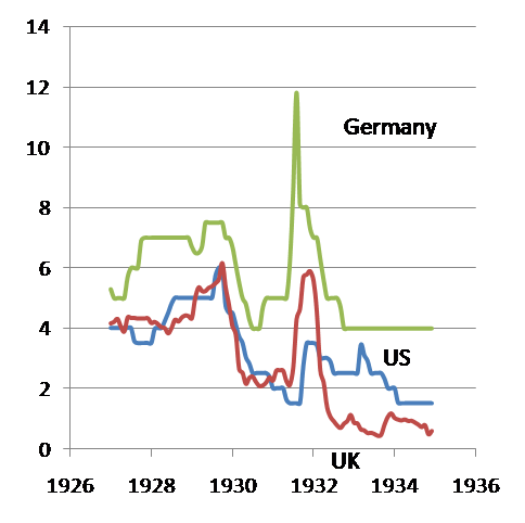
Brad DeLong from UCLA posts the following chart:

Brad DeLong from UCLA posts the following chart:
Sunday, March 29, 2009
Monetary Base
Prof Hamilton at Econbrowser has an instructive post on the monetary base.
He discusses the big changes to the Fed's balance sheet and concludes: "Does the explosive growth of the monetary base in Figure 1 imply uncontrollable inflationary pressures? My answer: not yet, but stay tuned."
He discusses the big changes to the Fed's balance sheet and concludes: "Does the explosive growth of the monetary base in Figure 1 imply uncontrollable inflationary pressures? My answer: not yet, but stay tuned."
Wednesday, March 25, 2009
Stocks vs Bonds
Brad De Long comments on Authers from the FT, adds this great chart:
and posts "Of course, going forward the current value of the Graham Ratio--of stock prices to the ten-year lagged moving average of real earnings--predicts that stocks will beat ten-year Treasuries by an average of 7.5% per year over the next decade..."
and posts "Of course, going forward the current value of the Graham Ratio--of stock prices to the ten-year lagged moving average of real earnings--predicts that stocks will beat ten-year Treasuries by an average of 7.5% per year over the next decade..."
Monday, March 23, 2009
Hedge Funds - Bridgewater Associates
Read this article on the world's largest hedge fund. (H/T abnormalreturns)

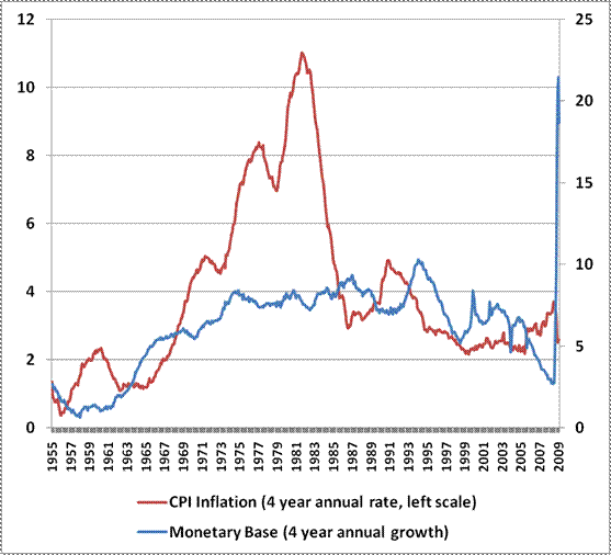
QE, Government Expenditures and Inflation
A very instructive weekly commentary by Mr John Hussman. His definition of inflation "Inflation basically measures the percentage change in the ratio of two “marginal utilities”: the marginal utility of real goods and services divided by the marginal utility (mostly for portfolio and transactions purposes) of government liabilities" and the examples he gives are worth keeping in mind. The following charts are particularly interesting.
First Monetary base and inflation:
Then Government expenditures and inflation:
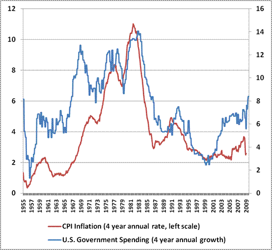
First Monetary base and inflation:
Then Government expenditures and inflation:
Sunday, March 22, 2009
"Good to Great"
I finally finished "Good to Great" by Jim Collings. The books explains "Why some companies make the leap... and others don't". I was attracted to the book wanting to know more about succesful companies and the key factors that differentiate them from the norm and their competitors.
The author and his research team identified 11 companies that made the leap (measured by stellar stock market performance). They then provide the framework that these companies have gone through to achieve their new status:
Start with a great leader (Level 5 leadership, humble but hardworking)
Get the right people on board
Listen to the facts
Focus on what you can be the best at, what you are passionate about and what drives your economic engine (Hedgehog Concept)
Be disciplined about the concept
Focus and build momentum to achieve breakthrough, The Flywheel (thanks to focus & results, no need for grand programs)The author and his research team identified 11 companies that made the leap (measured by stellar stock market performance). They then provide the framework that these companies have gone through to achieve their new status:
Start with a great leader (Level 5 leadership, humble but hardworking)
Get the right people on board
Listen to the facts
Focus on what you can be the best at, what you are passionate about and what drives your economic engine (Hedgehog Concept)
Be disciplined about the concept
As an investment tool trying to understand the possible Hedgehog Concept of the company you are looking at may be a good start. (Are they the best? Can they be the best? What is their economic engine?) See the diagnostic tool here.
I note however that some of the companies chosen did not survive very long after the book was published in 2001 (Fannie Mae, Circuit City are bust). I could not find any recent update at jimcollins.com or on the web but came across the following comment from Freakonomics author Steven Levitt:
http://freakonomics.blogs.nytimes.com/2008/07/28/from-good-to-great-to-below-average/
http://freakonomics.blogs.nytimes.com/2008/07/28/from-good-to-great-to-below-average/
The Good to Great companies are listed below. Since the end of 2001 (year-end after the book publication) Nucor has continued to outperform the broader market strongly. CC and FNM went bust, Gillette was acquired. The rest performed roughly in line with the market as this Yahoo chart illustrates (reset the start date at the bottom right to 12/31/2001).
Abbott Laboratories, Circuit City, Fannie Mae, Gillette, Kimberly-Clark, Kroger, Nucor, Philip Morris, Pitney Bowes, Walgreen, Wells Fargo
Saturday, March 21, 2009


Current Recession vs Great Depression
Paul Krugman compares industrial production now and then and comments: "At first, the current recession didn’t hit industrial production all that hard. But the pace accelerated dramatically last fall, so that at this point we’re sort of experiencing half a Great Depression. That’s pretty bad."

Thursday, March 19, 2009
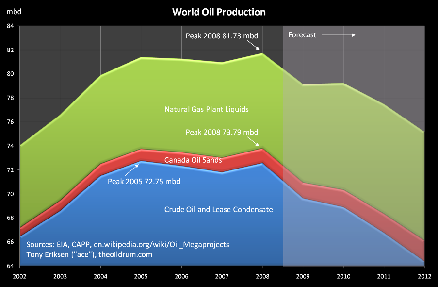
Peak Oil
The folks at the oil drum stick their neck out and post: "World oil production peaked in 2008 at 81.73 million barrels/day (mbd) shown in the chart below. This oil definition includes crude oil, lease condensate, oil sands and natural gas plant liquids. If natural gas plant liquids are excluded, then the production peak remains in 2008 but at 73.79 mbd. However, if oil sands are also excluded then crude oil and lease condensate production peaked in 2005 at 72.75 mbd."
Investing when down 50% from the past peak
I was intrigued by Jeremy Siegel's latest comment in Knowledge@Wharton that "once the market has fallen 50% your future returns are even better". So I went back to the data (monthly S&P500 close going back to Jan 1950) and found out that:
(1) Prior to the current crash and using month end data since Jan 50 the S&P 500 never had dropped by 50%.
(2) I therefore looked at 1year, 3 year, 5year and 10 year performances post a drop from the past peak of 40%. Since 1950 only nine months have been 40% below the past peak. It has then indeed paid off to invest as the following tables illustrates. Interestingly no negative performances were registered so far (see note below). It seems hence to be a rare and relatively safe opportunity.
Note that the jury on the 10 year performance following the 2000-2002 bear market is still out though it is not looking too good.
The table above compares the performances following the few occurences when the maket had dropped 40% to the average performances of all 1, 3, 5 and 10 year periods since Jan 1950.
Will have to look further using Shiller's data and real returns.
(1) Prior to the current crash and using month end data since Jan 50 the S&P 500 never had dropped by 50%.
(2) I therefore looked at 1year, 3 year, 5year and 10 year performances post a drop from the past peak of 40%. Since 1950 only nine months have been 40% below the past peak. It has then indeed paid off to invest as the following tables illustrates. Interestingly no negative performances were registered so far (see note below). It seems hence to be a rare and relatively safe opportunity.
| -40% from Peak | 1 YEAR | 3YEAR | 5YEAR | 10YEAR |
| Average | 29% | 46% | 65% | 146% |
| Min | 19% | 36% | 52% | 134% |
| Max | 36% | 53% | 87% | 161% |
| St Dev | 6% | 7% | 11% | 14% |
| All periods | ||||
| Average | 9% | 28% | 51% | 125% |
| Min | -45% | -43% | -36% | -41% |
| Max | 53% | 120% | 220% | 371% |
| St Dev | 20% | 30% | 48% | 88% |
Note that the jury on the 10 year performance following the 2000-2002 bear market is still out though it is not looking too good.
The table above compares the performances following the few occurences when the maket had dropped 40% to the average performances of all 1, 3, 5 and 10 year periods since Jan 1950.
Will have to look further using Shiller's data and real returns.
Tuesday, March 17, 2009


Monday, March 16, 2009
"What will recovery look like?"
Excellent post from James Hamilton at Econbrowser on "What will recovery look like?"
The post has interesting long term charts of some of the key components of GDP as well as the chart below which "averages" all post WWII recessions (ex the current one).

Average cumulative change in 100 times the natural log of real GDP or its respective component beginning from the business cycle peak for the 10 recessions between 1947 and 2001. Horizontal axis denotes quarters after the peak.
Prof Hamilton also shows the path of the current slump:

And compares it to the big 1981-82 recession:

At least he is mentioning recovery.
The Minneapolis Fed has a nice tool to compare recessions. You can find it here.
The post has interesting long term charts of some of the key components of GDP as well as the chart below which "averages" all post WWII recessions (ex the current one).
Average cumulative change in 100 times the natural log of real GDP or its respective component beginning from the business cycle peak for the 10 recessions between 1947 and 2001. Horizontal axis denotes quarters after the peak.
Prof Hamilton also shows the path of the current slump:
And compares it to the big 1981-82 recession:
At least he is mentioning recovery.
The Minneapolis Fed has a nice tool to compare recessions. You can find it here.
Sunday, March 15, 2009


Swenson on Investing
InfectiousGreed refers to a nice interview of David Swenson, the manager of the Yale endowment.
On stocks:
"So people should not be afraid of stocks now?
"Many young people today believe they will never be as prosperous as their parents. Should young adults have hope?
"In his book Unconventional Success: A Fundamental Approach to Personal Investment, Swensen recommends the following allocations, for individual investors who want a "well-diversified, equity-oriented portfolio":
On stocks:
"So people should not be afraid of stocks now?
S: Not only should they not be afraid, they should be enthusiastic. One of the great ironies is that if you had talked to the average investor 18 months ago, he or she would have thought it was a pretty good idea to buy stocks. In recent months, the same investors despair about their portfolio and are fearful about putting money into the equity market.
That's 180 degrees wrong. They should have been cautious 18 months ago, when prices were much higher than they are now. They should be enthusiastic today."
On the outlook:"Many young people today believe they will never be as prosperous as their parents. Should young adults have hope?
S: I'm an incredible optimist. We should be careful not to underestimate the resilience of this economy. I think we could have, in the next couple of years, a very hard slog. Looking five or ten years down the road, I'm very optimistic that we will come out of this strong and better."
On Asset Allocation:"In his book Unconventional Success: A Fundamental Approach to Personal Investment, Swensen recommends the following allocations, for individual investors who want a "well-diversified, equity-oriented portfolio":
30% Domestic stock funds
20% Real estate investment trusts
15% U.S. Treasury bonds
15% U.S. Treasury inflation-protected securities
15% Foreign developed-market stock funds (the EU, Japan, Australia, etc.)
5% Emerging-market stock funds (Brazil, Russia, India, China, Taiwan, Korea, and the rest of the developing world)
Today, Swensen says, economic conditions might call for a modest revision. He now recommends that investors have 15 percent of their assets in real estate investment trusts, and raise their investment in emerging-market stock funds to 10 percent."
Update: Felix Salmon on what the above mix would have done in 08.
Spain - "this is going to be ugly"
Paul Krugman is not very optimisitic for Europe's prospects, notably those of Spain.
At least he does not think "exiting the Euro is feasible".
At least he does not think "exiting the Euro is feasible".
Friday, March 13, 2009
Tobin's Q
The Fed recently released it latest quarterly flow of funds data. The data can be used to calculate Tobin's Q measure of market valuation.
See Wikipedia here
See some source data here and a recent comment from Felix Salmon. Naked Capitalism is skeptical as to the use of the ratio to call market bottom. I concur but I'll revert with a post on trading strategies using valuation as a guide.
In the meantime here is a chart combining the source data mentionned above as well as the latest flow of funds data (Table b102, row 35 / row 32)

Thursday, March 12, 2009
Saving Rate
The St. Louis Fed has a very nice charting tool. Here is the impressive move in the personal saving rate from 0% in April 08 to 5% in January 09. Savings went from 0 to 544bn US$.
Looking at the source data it appears disposable personal income increased by 337bn US$ thanks to lower personal current taxes of 183bn. Personal outlays decreased by 207bn US$.
Looking at the source data it appears disposable personal income increased by 337bn US$ thanks to lower personal current taxes of 183bn. Personal outlays decreased by 207bn US$.
Tuesday, March 10, 2009
"Bottom Rung"
Moody's just released a new list of bond issuers likely to default (or miss a payment). Zero Hedge has the full list while the WSJ lists the 30 largest issuers here.
Death List -- Companies Outlook Q1 2009
Death List -- Companies Outlook Q1 2009
"Irrelevant Lehman?"
Asks Paul Krugman. He disagrees with John B. Taylor, refers to James Surowiecki's comment in the New Yorker and uses the following image:
"You’re looking at some building, and you hear the fire alarm go off, and smoke starts trickling out the windows. Then a lot of fire trucks and firemen arrive — and only after that do flames start shooting out the top of the building. Clearly, the fire department turned a small problem into a crisis."
"You’re looking at some building, and you hear the fire alarm go off, and smoke starts trickling out the windows. Then a lot of fire trucks and firemen arrive — and only after that do flames start shooting out the top of the building. Clearly, the fire department turned a small problem into a crisis."
Monday, March 9, 2009
"First homes, then cars, and last business equipment"
CalculatedRisk created the following tables based on a paper by Prof Edward E. Leamer from UCLA tackling the temporal order of GDP components.
When Weakness Typically Starts| Pre-Recession | Coincident with Recession | Lags Start of Recession | |
| Residential Investment | PCE | Investment, non-residential Structures | |
| Investment, Equipment & Software | |||
| Unemployment |
| During Recession | Lags End of Recession | Significantly Lags End of Recession | |
| Residential Investment | Investment, Equipment & Software | Investment, non-residential Structures | |
| PCE | Unemployment(1) | ||
CR quotes: "The first item to soften and the first to turn back up is residential investment. The temporal ordering of the spending weakness is: residential investment, consumer durables, consumer nondurables and consumer services before the recession, and then, once the recession officially commences, business spending on the short-lived assets, equipment and software, and, last, business spending on the long-lived assets. The ordering in the recovery is exactly the same."
Will homebuilding and retail be among the first sectors to recover from the current bear market?
Saturday, March 7, 2009
Bank Liabilities and CDS
Great post by baselinscenario.com with the following scary chart of banks' CDS spreads.

Here is a short CDS primer. For a 1 year CDS Spread S the implied probability of default p is S/(1-R) where R is the Recovery rate.
Here is a short CDS primer. For a 1 year CDS Spread S the implied probability of default p is S/(1-R) where R is the Recovery rate.

Wednesday, March 4, 2009
"To nationalise or not, that is the question"
The debate continues. Martin Wolf in the FT asks "To Nationalise or not, that is the question" and concludes: "Call it a banana if you want. But bank restructuring itself must begin."
While doing so he quotes a fairly informative paper from Douglas Elliott of the Brookings Institution that addresses the following questions:
The background: Why might widespread nationalization be necessary? To restore capital adequacy
What does it mean to “nationalize the banks? Full or partial, temporary or permanent nationalization, how would the bank be controlled? what is the exit strategy?
What would be the purposes of nationalization? avoid throwing good money after bad, save taxpayers money.
What are the arguments against nationalization? scaring shareholders and creditors of weaker banks, pricing and fairness.
How has nationalization worked previously in the U.S. and internationally? Ok in the US with the nationalization of Continental Illinois in 1984, then the sixth largest bank with "only" 40bn US$ in assets. It still took seven year to completely divest the taxpayers' share. Indymac with 34bn in assets was in government's hands for a half a year. OK in Sweden as well with a cost to taxpayers of roughly 4% of GDP.
How could nationalization be implemented most effectively? Design a set of clear criterias and objectives, avoid political pressure, decide who is in charge and set a clear exit strategy.
The stress tests is a one of the criterias currently being implemented. Via CalculatedRisk here is a list of the likely 19 institutions with over 100bn in US$ assets that will be "stress tested". The list was compiled by Paul Kiel at propublica.org. I have added to the table the ytd stock market performance (as of March 4, ie before today's crash) to see which one may pass the tests. (red if the ytd perf is below the median of -56% and green otherwise)
| Name | Total Assets (Billions) | YTD Perf |
| 1. JPMorgan Chase | 2,175 | -39% |
| 2. Citigroup | 1,947 | -83% |
| 3. Bank of America (not including Merrill Lynch) | 1,822 | -77% |
| 4. Wells Fargo | 1,310 | -67% |
| 5. Goldman Sachs | 885 | 1% |
| 6. Morgan Stanley | 659 | 21% |
| 7. MetLife | 502 | -58% |
| 8. PNC Financial Services | 291 | -53% |
| 9. U.S. Bancorp | 267 | -56% |
| 10. Bank of New York Mellon | 238 | -22% |
| 11. GMAC | 189 | -59% |
| 12. SunTrust | 189 | -63% |
| 13. State Street | 177 | -43% |
| 14. Capital One Financial Corp. | 166 | -67% |
| 15. BB&T | 152 | -45% |
| 16. Regions Financial Corp. | 146 | -56% |
| 17. American Express | 126 | -37% |
| 18. Fifth Third Bancorp | 120 | -79% |
| 19. KeyCorp | 105 | -24% |
Monday, March 2, 2009

Calling a bottom?
CrossingWallstreet explains why "Trying to pick the bottom, however, is a dangerous undertaking and is, in his opinion, best left alone".
With the market making new lows Prof James Hamilton has an excellent post on stock prices and fundamentals trying to answer the question: "How low can stock prices go, and how worried should you be?"
He uses a Dividend Discount Model under two scenarios (1) real dividend grow 2% from the last reported value (2) dividends first follow the same path as during the great depression and then grow again.

Figure 4.Black line: actual stock price. Blue line: perfect-foresight price P*(t) under scenario 1. Green line: perfect-foresight price under scenario 2 (Great Depression II with dividends taking the same path as between 1931 and 1936)
According to Prof Hamilton at 608 the S&P500 would price in the same dividend trajectory as during the great depression and 5.5% real annual returns forever.
At a level of 735 and assuming the market drops to 608 before recovering the market is pricing in 3.6% real return over 10 years. Not bad.
His conclusion: "Of course, under this scenario you would do better waiting for the market to recognize the depression and wait to buy at 608 rather than now at 735. Moreover, given the historical tendency for over exuberance in upswings and excessive pessimism in downturns, you might expect the actual price to fall well below 600 in another depression, at which point there will be returns to be had well in excess of 5.5% if you time your moves just so.
With the market making new lows Prof James Hamilton has an excellent post on stock prices and fundamentals trying to answer the question: "How low can stock prices go, and how worried should you be?"
He uses a Dividend Discount Model under two scenarios (1) real dividend grow 2% from the last reported value (2) dividends first follow the same path as during the great depression and then grow again.
Figure 4.Black line: actual stock price. Blue line: perfect-foresight price P*(t) under scenario 1. Green line: perfect-foresight price under scenario 2 (Great Depression II with dividends taking the same path as between 1931 and 1936)
According to Prof Hamilton at 608 the S&P500 would price in the same dividend trajectory as during the great depression and 5.5% real annual returns forever.At a level of 735 and assuming the market drops to 608 before recovering the market is pricing in 3.6% real return over 10 years. Not bad.
His conclusion: "Of course, under this scenario you would do better waiting for the market to recognize the depression and wait to buy at 608 rather than now at 735. Moreover, given the historical tendency for over exuberance in upswings and excessive pessimism in downturns, you might expect the actual price to fall well below 600 in another depression, at which point there will be returns to be had well in excess of 5.5% if you time your moves just so.
But good luck with carrying out that particular scheme. After all, scenario 2 assumed we're about to start another Great Depression, and hopefully it goes without saying that this need not necessarily happen. If it doesn't, you may find yourself waiting for the S&P to fall below 600 until you're both retired and dead. If the downside to investing now, even under the depression scenario, is better than a 3% average real rate of return over the next decade, I can live with that."
Note: here is a link to an older post on investments.
Subscribe to:
Posts (Atom)

