Thursday, December 31, 2009

Outlook 2010

It is this time of the year again... Here is a summary of 2010 forecasts for the S&P500.

Targets for 2010 range from 1120 to 1350 with an average of 1239, up ca 10% from today's level.

As usual to be taken with a grain of salt though last year's bunch of strategists did okay with three of them pretty much on target.

Bloomberg has a similar summary here with the key data pasted below:

The following table presents estimates from strategists at
brokerages for where the S&P 500 will finish 2010 and the
implied percentage change from today’s close of 1,114.11.

Firm Strategist Estimate %Change
Bank of America David Bianco 1,275 14.4
Barclays Barry Knapp 1,120 0.5
Citigroup Tobias Levkovich 1,150 3.2
Credit Suisse Andrew Garthwaite 1,125 1.0
Deutsche Bank Binky Chadha 1,260 13.1
Goldman Sachs David Kostin 1,250 12.2
JPMorgan Thomas Lee 1,300 16.7
Oppenheimer Brian Belski 1,300 16.7
RBC Myles Zyblock 1,200 7.7
UBS Thomas Doerflinger 1,250 12.2
AVERAGE 1,223 9.8

HAPPY NEW YEAR!

Tuesday, December 29, 2009

A great map of the world

H/T Bill Easterly for the picture. Have my doubt about India's color though.

Chinese Savers

Here is a short summary of the reasons why Chinese are such great savers (ca50% of their income or 2.5tn USD per year). The author goes over Confucianism (Not it reading Chinese philosopher Mozi), the lack of safety nets, demography and finally their undervalued currency.

Monday, December 28, 2009

A lost decade?

Paul Krugman sums up the past decade "The Big Zero":

"It was a decade with basically zero job creation. O.K., the headline employment number for December 2009 will be slightly higher than that for December 1999, but only slightly. And private-sector employment has actually declined — the first decade on record in which that happened.

It was a decade with zero economic gains for the typical family. Actually, even at the height of the alleged “Bush boom,” in 2007, median household income adjusted for inflation was lower than it had been in 1999. And you know what happened next.

It was a decade of zero gains for homeowners, even if they bought early: right now housing prices, adjusted for inflation, are roughly back to where they were at the beginning of the decade. And for those who bought in the decade’s middle years — when all the serious people ridiculed warnings that housing prices made no sense, that we were in the middle of a gigantic bubble — well, I feel your pain. Almost a quarter of all mortgages in America, and 45 percent of mortgages in Florida, are underwater, with owners owing more than their houses are worth.

Last and least for most Americans — but a big deal for retirement accounts, not to mention the talking heads on financial TV — it was a decade of zero gains for stocks, even without taking inflation into account. Remember the excitement when the Dow first topped 10,000, and best-selling books like “Dow 36,000” predicted that the good times would just keep rolling? Well, that was back in 1999. Last week the market closed at 10,520."

Econbrowser explains why the decade was a lost one for stocks as well. Stocks entered the decade massively overvalued. This has now somewhat improved. Don't get too excited though. Looking at Prof Shiller's data when stocks have been more richly valued than now (PE10E of 20.3) stocks have delivered zero real returns a decade later on average.

Time to look forward to the new one!


Monetary Base

Greg Mankiw has reassuring comments on this scary chart:


He writes: "It is true that the monetary base is exploding. See the above graph. Normally, such surge in the monetary base would be inflationary. The textbook story is that an increase in the monetary base will increase bank lending, which will increase the broad monetary aggregates such as M2, which in the long run leads to inflation.

That is not happening right now, however. The broader monetary aggregates are not surging. Much of the base is instead being held as excess reserves.

But, you might ask, won't the inflationary logic eventually take hold as the economy recovers and banks start lending more freely? Not necessarily. Recall that the Fed now pays interest on reserves. As long as the interest rate on reserves is high enough, banks should be happy to hold onto those excess reserves. That should prevent a surge in the monetary base from being inflationary."

Tuesday, December 22, 2009

Real Estate Prices Not Yet Back to Trend

Home prices indices are reportedly dropping again after a shortlived rebound. (H/T CalculatedRisk)
The chart below looks at where home prices stand compared to a continuation of the trend from Jan 76 to Dec 99 (ex bubble years).

Prices are still well above the long term trend (ex bubble) and as the 90's episode illustrates prices have corrected below trend in the past. The rebound in prices might well have been short-lived. If prices stabilize at these level it would take a good 4 years for the trend to get there.

Monday, December 21, 2009

What Went Wrong

Great little wrap up on the crisis from Econbrowser. He highlights the US Treasury's recent proposal for reform of the financial system:
"
  • Introduce a legal mechanism whereby large financial institutions that are not commercial banks (such as AIG or Bear Stearns) can be liquidated in an orderly manner without bankruptcy or bailouts, analogous to the authority that the FDIC currently has to take over failing banks.
  • Subject the banklike functions of investment banks and structured investment vehicles (that is, the activity of borrowing short and lending long) to the same capital requirements as standard banking.
  • Require either mortgage originators or the mortgage securitizers to retain 5 percent of the product they create. I would take that idea a step farther, endorsing Princeton Professor Alan Blinder's proposal that originators and securitizers should each hold 5 percent.
  • Move the trading of financial derivatives like credit default swaps to centralized exchanges where they would be subject to a robust regime of regulation including conservative capital requirements, margins, and reporting requirements. To the Treasury's proposal, I would also recommend adding stop-loss provisions that regulators could use to limit the promises made and losses suffered by systemically important financial institutions as a result of their trading in financial derivative contracts.
  • Set guidelines for individual compensation systems at systemically important financial institutions in order to better align the personal rewards of traders with the interests of shareholders and the public."

Sunday, December 13, 2009

After the BRIC the BRINK

H/T Paul Kedrosky for pointing out to a new acronym via the WSJ. After the BRIC who defined oil demand in the past decade, the BRINK expected to define oil supply in the next one.
Brazil, Russia, Iraq, Nigeria and Kazakhstan: "Brazil has hosted a string of big discoveries, while Russia has defied expectations by overtaking Saudi Arabia's output. Kazakhstan is expanding three major projects, while a tentative peace is allowing Nigeria to start raising output.
The wild card is Iraq, where more licenses for foreign oil companies were awarded Friday. Contract terms encourage firms to maximize output quickly. Winners to date aim to boost output from five fields 12-fold to 8.5 million barrels per day."

Thursday, December 3, 2009

Pershing Square invests in Nestlé

Dealbook posts Pershing Square's latest quarterly comment in which they disclose their new investment in Nestlé. The stock seems to be the darling of famous investors. After Warren Buffett William A. Ackman has also become an investor. Their rationale can be read here. In Short Nestle, the world's largest food and beverage company has a great brand portfolio, it is gaining share in developped markets and growing in the high single to low teen in emerging markets. Pershing sees 1bn of annual cost cutting potential for the next few years and a 28bn cash bonanza if Nestle puts its Alcan shares to Novartis.

Peak in US Unemployment in 2011?

CalculatedRisk mentions Goldman Sachs' view:
The key features of our 2011 outlook: (1) a strengthening in growth from 2.1% on average in 2010 to 2.4% in 2011, with real GDP rising at an above-potential 3½% pace in late 2011; (2) a peaking in unemployment in mid-2011 at about 10¾%; (3) extremely low inflation – close to zero on a core basis during 2011; and (4) a continuation of the Fed’s (near) zero interest rate policy (ZIRP) throughout 2011.
The peak in unemployment is much later than suggested by CR's own look at housing starts and employment and also much later than what the Fed expects. As Paul Krugman reported here: "Well, the Fed expects unemployment to come down only very gradually — over 9 percent at the end of 2010, over 8 percent at the end of 2011, around 7 percent at the end of 2012. Inflation, meanwhile is expected to remain consistently below the Fed’s target."

Zirp could well last a while longer

Saturday, November 21, 2009

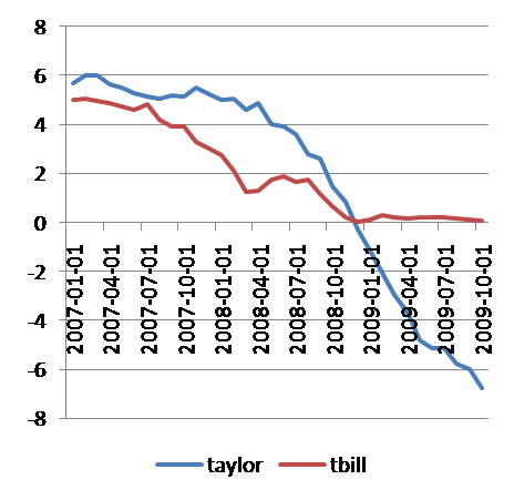
Fed Fund Rates and Taylor Rule

Paul Krugman has the chart and concludes: "Monetary tightening shouldn’t be on the agenda for a long, long time."

Saturday, November 14, 2009

Housing Starts and Unemployment Rate

CalculatedRisk has the chart and the explanations on a very close correlation between housing starts and the unemployment rate. Housing leads the economy and employment by 12 to 18months. According to CR this suggests unemployment may peak in spring 2010. Could central banks be tightening this coming summer? Earlier than suggested here.

Tuesday, October 13, 2009

No Walk the Talk for Exxon

As usual Econbrowser has a great post, this time on the difficulties of raising oil supply.
He writes: "The dark blue line in the figure below shows the company's production each year since 1999. Four years ago, Stuart Staniford noted that ExxonMobil's 2001 annual report predicted 3% annual growth in production between 2001 and 2007. That projection appears as the red line in the graph below; didn't quite come out as planned. Stuart's theory was that the company correctly predicted the contribution of its new discoveries, but underestimated the declining production rates from mature fields.

ExxonMobil again predicted in 2006 that it could achieve 3% annual growth over 2006-2011. I've shown that forecast as the lighter blue line in the figure. We still have two more years to make that one right, I suppose."


Monday, October 12, 2009

Krugman, Taylor Rule and Okun's Law

Very interesting post by Paul Krugman on why the Fed should not raise rates anytime soon.
Solving the Taylor Rule for a Fed Fund Target of 0% and the current inflation rate gives the unemployment rate level at which the fed should start raising rates.

The table below shows the different unemployment rates at which the fed should tighten assuming different inflation rates.

Change in PCE 0.0% 0.5% 1.0% 1.6% 2.0% 2.5% 3.0% 3.5% 4.0% 4.5% 5.0%
Unemployment 5.8% 6.2% 6.6% 7.0% 7.3% 7.7% 8.1% 8.4% 8.8% 9.2% 9.6%


Mr Krugman then looks at Okun's law which says that GDP growth 2 points above potential of 2.5% reduces unemployement by 1% and concludes: "So say we have 5 percent growth for the next 2 years — which would be hailed as a stunning boom. Even so, unemployment should fall only 2.5 points, to 7.3. In other words, even with a really strong recovery (which almost nobody expects), the Fed should keep rates on hold for at least two years."

Tuesday, October 6, 2009

S&P500 Fair Value

Eddy Elfenbein at CrossingWallstreet sums it up:

"For 2009, the S&P 500 will make around $55 to $60 a share. For 2010, earnings will probably be around $75 a share. For 2011, and now it’s starting to become hard to forecast, Wall Street sees earnings at $92 a share.

If that’s correct, then the stock market is still pretty inexpensive. At 15 times earnings, $92 a share translates to 1380 for the index by the end of 2011. If we discount that by 8% to today (I get 8% by adding a 3% premium to 5% which is about where AAA corporates are), we get 1160."

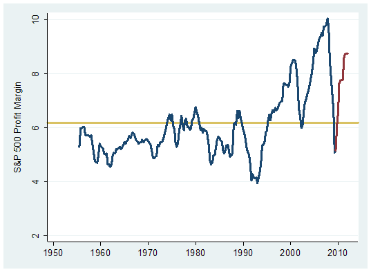
At Hussman Funds Bill Hester appears less optimistic arguing that analysts now expect margins to recover to peak level, an unlikely scenario in a lower growth environment.

Sunday, October 4, 2009

Lags between end of recession, unemployment rate peak and fed tightening

Macroblog offers the following table:

Historical lags between end of recession, unemployment rate peak, and beginning of funds rate tightening cycle

End of Recession Unempl.
rate peak
Beginning of funds rate tightening cycle Months from end of recession to unempl. peak Months from unempl. peak to beginning of funds rate tightening cycle
Nov 2001 Jun 2003 Jul 2004 19 13
Mar 1991 Jun 1992 Feb 1994 15 20
Nov 1982 Dec 1982 Jun 1983 1 6
(Jul 1980)


Mar 1975 May 1975 May 1976 2 12
Nov 1970 Aug 1971* Mar 1972 9 7
*Following the 1970 recession, the unemployment rate was 6.1 in December 1970 and again in August 1971. If the December 1970 peak is used, months from end of recession to unemployment peak is 1 and months from unemployment peak to beginning of funds rate tightening cycle is 15.
Source: Bureau of Labor Statistics, National Bureau of Economic Research, and Federal Reserve Board

Rates could stay low for a while

Wednesday, September 23, 2009

Sometimes I wish I was a student again...

... taking Brad de Long's exam:

No calculators allowed, You won’t need them. All you will need is simple arithmetic (the ability to multiply things by two, and to divide) and the rule of 72—the fact that a quantity growing at 1% per year doubles in 72 years, a quantity growing at 2% per year doubles in 36 years, a quantity growing at 0.5% per year doubles in 144 years, et cetera, a quantity growing at 1% per year grows by 41.41% in 36 years, etc…

PART 3 (25 MINUTES): Calculations

Consider the 144 years between 1866 and 2010…

  1. World population grew from about 1.1 billion to 6.4 billion. About how many doublings did population undergo? What is the average growth rate of world population over those 144 years?
  2. World total real GDP (on one somewhat arbitrary set of assumptions, at least) grew from $875 billion of today’s dollars in 1866 to $56 trillion of today’s dollars today. What was the average growth rate of world total real GDP over those 144 years?
  3. If world total real GDP growth continues to grow at its average 1866-2010 rate, what will world total real GDP (in today’s dollars) be in 2155? Do you think this is possible? Reasonable? Absurd? Why?
  4. By contrast, total world GDP (on one somewhat arbitrary set of assumptions, at least) grew from $437.5 billion of today’s dollars in 1794 to $875 billion of today’s dollars in 1866. Suppose total world real GDP growth had continued at its 1794-1866 pace from 1866-2010. What would total world real GDP be today?

If I follow correctly. 2. implies 6 doublings in 144 years or an annual growth rate of 3%.
4. implies a growth rate of 1% (1 doubling in 72 years) continuing at that pace for an other 144 years the economy would have experienced two doublings to 3.5 trillion, not even 10% of today's size. Amazing!

Monday, September 21, 2009

"The Anarchy of Success"

Two book reviews in one by William Easterly at Aidwatch. The blog summary is here but the long piece is well worth reading.
In development economics beware of
Pattern in the clouds ("Humans are suckers for finding patterns where none really exist, like seeing the shapes of lions and giraffes in the clouds.")
Confirmation Bias ("When the evidence is mixed, we tend to select the parts of the evidence that confirm what we already believe")
Law of Small Numbers ("our tendency to judge performance by too small a slice of experience")

Key conclusions from Easterly:
"One way to escape from the Law of Small Numbers is to seek to explain levels of per capita income already attained today rather than rates of growth. The level of income you have reached today frees you from small numbers because it reflects the outcome of your entire previous growth experience. So let's ask, who are the richest and the poorest countries now, and what is the difference between them? I argued above that the now-rich countries leaped ahead during a long period in which they were more free-trade and free-market (although far from laissez-faire) than the rest of the world. Economists therefore have a much higher degree of consensus on this question—both evidence and intuition suggest that such things as education, private property, contract enforcement, and freedom from government expropriation contribute to economic development.
These findings just confirm the Western consensus around the basic concept of a state shaped by representative democracy, safeguarding individual rights and supplying crucial infrastructure such as transport, while rewarding entrepreneurship and technological creativity. Such common-sense ideas have stood the test of time over the very long run, both in their acceptance by the population in most economically successful societies (compared to their absence and rejection in unsuccessful economies) and in their pragmatic consequences for prosperity (as showed by the comparison to the poverty of states that lack most of the above conditions). Development is too complex to fit these ideas 100 percent of the time, of course—there are authoritarian exceptions like Singapore. China is not yet an exception because its income level is still less than one tenth that of the US. We can conjecture that China's rapid change in income has followed positive changes in individual economic (and even some political) rights."

"Perhaps prosperity is not after all designed from above; perhaps it emerges from below, from the independent actions of many individuals who figure out their own paths."

In the end, Korea didn't need experts like Ha-Joon Chang as much it needed entrepreneurs like Ju-Yung Chung. Chung was the son of North Korean peasant farmers, who had to leave school at fourteen to support his family. He had failed at successive jobs as a railway construction laborer, a dockhand, a bookkeeper, and a deliveryman for a rice shop in Seoul. At age twenty-two, he took over the rice shop, but it failed. He started A-Do Service Garage to do auto repair, which also failed. At age thirty-one in 1946 in Seoul, Chung again started an auto service, which finally became his first successful business. That auto service grew and diversified over the years. It is now known as Hyundai."

Sunday, September 20, 2009

Thomas Friedman on Renewable Energy

His Op Ed is here. I quote: "Here is what is indisputable: The world is on track to add another 2.5 billion people by 2050, and many will be aspiring to live American-like, high-energy lifestyles. In such a world, renewable energy — where the variable cost of your fuel, sun or wind, is zero — will be in huge demand.China now understands that. It no longer believes it can pollute its way to prosperity because it would choke to death. That is the most important shift in the world in the last 18 months. China has decided that clean-tech is going to be the next great global industry and is now creating a massive domestic market for solar and wind, which will give it a great export platform"

Industrial production to bounce back?

Econbrowser in a great post on the current economic conditions posts the following chart from angry bear. According to this chart it appears the more severe the downturn in IP the stronger the rebound.

Friday, September 18, 2009

Global Oil demand per Capita: 4.6barrels/person/year

Thanks Morgan Downey for the info:

Two unrelated oil charts

First from this week's economist I was surprised to see that petrol prices are actually higher in China than in the US:


Second via FT Alphaville a great chart from Morgan Downey on Oil in tankers floating around the world.

Thursday, September 17, 2009

V-Shape or Double Dip?

Paul Krugman illustrates very well why the risks of a double dip are real.
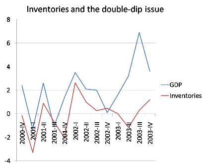
"There’s a tendency to treat worries about a double dip as outlandish, as something only crazy people like the people who, um, predicted the current crisis worry about. But there are some real reasons for concern. One is that the lift from fiscal stimulus will start to fade out in a couple of quarters. Another is that, as Yellen points out, most of the boost we’re getting now is tied to inventories. And that’s a one-time thing. You don’t have to look back very far to see just how transitory an inventory-led boost can be. The figure below shows growth before, during, and after the 2001 recession, together with the contribution of inventory changes to growth. Notice the boost from 2001IV to 2002I from inventories, then the fading out that almost, but not quite, turned into contraction later in 2002. It wasn’t literally a double-dip, W-shaped recession, but it came close.

Econbrowser more optimistically points towards Deutsche Bank's "credit impulse" indicator indicating a V-shape recovery. "Deleveraging implies slow growth in total credit, and according to the usual reasoning, slow growth in GDP. Several of Deutsche Bank's economists, however, focus on what they call the credit impulse. They provide the following provocative graph, which suggests a rapid recovery:"


Tuesday, September 15, 2009

World Oil: Market or Mayhem?

Came across this great paper by James L. Smith on the world oil market. The author addresses the following questions:
(1) Why are oil prices so volatile?
(2) What is OPEC and what does OPEC do?
(3) What is the equilibrium price of oil?
(4) Is “peak oil” a genuine concern?
(5) Why did oil prices spike in 2008, and what role (if any) did speculators play?

Lots a of great infos in there that I quote below.
(1) Oil price volatility - "What creates high volatility, for both oil and gas, is the inelasticity of demand and supply, plus the substantial lead times required to efficiently alter the stock of fuelconsuming equipment, or to augment the productive capacity of oil and gas fields. Volatility provides incentives for holding large inventories, but since inventories are costly, they cannot fully offset the rigidity of demand and supply.

Empirical estimates of the price elasticity of demand for crude oil vary by place, time, and statistical technique. Estimates of -0.05 (short-run) and -0.35 (long-run) are typical, with several years required to complete the adjustment to a permanent price change.

Income elasticities of demand for crude oil appear to vary significantly by level of income, with near proportional growth in oil demand in many developing countries (EI ≈ 1.00), but much slower growth in the industrialized world (EI ≈ 0.50). It follows that future growth of demand for oil, and therefore the equilibrium price level, hinges on economic growth rates in China, India, etc.

It is more difficult to produce current and reliable estimates of the elasticity of crude oil supply, due in part to confounding effects of resource depletion and technical innovation, but there is consensus that the supply of conventional oil is inelastic. The U.S. Energy Information Administration uses elasticities of 0.02 (short-run) and 0.10 (long-run) for most regions in its international oil supply model.

(2) OPEC controls 70% of global oil reserves, OPEC’s goal is to set the price by (1) shutting in existing production capacity, and (2) limiting the growth of new capacity. According to Smith OPEC has mostly failed at the former, but succeeded at the latter.

Since the quota system was adopted in 1983, total OPEC production has exceeded the ceiling by 4% on average, but on numerous occasions the excess has run to 15% or more. In general, full compliance has been achieved only during episodes, like the present, when members have not had enough installed capacity to exceed their quotas; i.e., when it has been physically impossible to cheat on their production limits.

OPEC’s crude oil production capacity (33 mmb/d) is virtually unchanged from 1973, although the volume of proved reserves (i.e., known deposits that could have been tapped to expand capacity) doubled over that span. OPEC’s installed capacity is sufficient to extract just 1.5% of its proved reserves per year, which is another way of measuring the low intensity of development.

On the other hand, non-OPEC producers, working mostly in less prolific and more expensive petroleum provinces, have increased their production capacity by 69% since 1973, and installed sufficient facilities to extract 5.6% of their proved reserves each year.

OPEC accounted for only 10% of the petroleum industry’s upstream capital investment during the past decade, although it produced nearly half of global output

OPEC has recently initiated numerous projects to tap their under-developed reserves and finally expand capacity. $40 billion per year is budgeted for this going forward.

In 2007, the five largest international oil companies (the super-majors), who collectively own just 3% of global oil reserves, spent about $75 billion to develop new production capacity. OPEC, with about twenty times the reserves, spends only about half as much in absolute terms.

OPEC restraint is also reflected in the upstream plowback rate: in 2007, the super-majors reinvested 25% of their gross production revenues to expand capacity, whereas OPEC members are investing only about 6% of their net export revenues on such projects.

(3) Equilibrium Price of Oil: the author uses a simple model with Saudi Arabia as a Stackelberg leader—a producer who anticipates the reaction of consumers and all other (price-taking) producers, and who sets its own output (and price) accordingly. Solving with the then price level of 115 would imply marginal costs for Saudi Arabia of 83$, much high than most estimates of 5 to 15$.

Other model used such as depletion cannot explain the the then high price of oil. Could the reason lie on the supply side and hence the look at

(4) Peak Oil - The so-called “Hubbert curve” might have been forgotten altogether but for the
fact that Hubbert’s 1956 prediction that U.S. oil production would peak around 1970 was famously borne out. It should also be noted (but usually is not) that the predicted volume of oil to be produced at the peak was 37% too low, and that Hubbert’s predictions regarding coal and natural gas ran badly amiss.

Hubbert predicted that U.S. oil production would peak at 3 billion barrels per year; actual production in 1970 was 4.1 billion barrels. Hubbert predicted that U.S. gas production would peak at 14 trillion cubic feet per year in 1973; actual production was 20 trillion cubic feet in 2007. Hubbert predicted that global coal production will peak in 2150 at about 6.4 billion metric tonnes; actual production reached that level in 2007 and is still growing rapidly.

The crucial fact is that while oil is constantly being “used up” the world is not “running out” of oil. Indeed, Adelman and Watkins (2008) make a strong case that the depletable resource paradigm is not empirically relevant. Since its inception, the oil industry has endeavored to replace every barrel extracted from the earth by investing in new projects to find and develop additional resources, so far with great success. Despite our having consumed almost 700 billion barrels of crude oil during the past quartercentury, the volume of remaining proved reserves available to support future production has doubled since 1980 and now stands at an all-time high. The stock of proved reserves has grown even faster than production, which means that the “reserves to production ratio” has grown, and that we now extract a smaller fraction of remaining reserves each year than previously. The implication is undeniable: increasing physical scarcity, the currency of the peak oil club, can not have triggered oil’s recent ascent.

(5) Speculators - Relative to the size of the world oil market, hedge funds and the “super-major” oil companies are indeed small fry. To succeed at price fixing, one of two things would be required: (1) accumulating large private inventories that are diverted from the commercial supply chain; or (2) shutting in a significant portion of global oil production. Neither phenomenon has been observed."

Solar Crisis?

Via Paul Kedrosky a Digitimes article on the current solar panel oversupply.

The Information Network: Planned global solar capacity increases, 2008-2010

Item

2008

2009

2010

Solar consumption (MW)

5,625

4,894

6,215

Solar capacity (MW)

11,722

17,551

24,212

Utilization

48.0%

27.9%

25.7%

Inventory days

71

122

133

Source: The Information Network, compiled by Digitimes, September 2009

Expect prices to drop further "Average selling prices could drop below US$1 per watt in 2010 and US$0.50 in 2011. As many as 50% of the more than 200 solar manufacturers, mired in red ink with current selling prices above US$2.00 per watt, may not survive, The Information Network stated." These price drops will most likely help adoption and the industry leaders.

To put things in perspectives Global Energy Consumption is around 472 quadrillion Btu. (see BP or EIA) which equals to ca 15.8 TWyr as 1 TWyr = 8.76 x 10¹² kWh = 31.54 EJ = 29.89 quad.
Alternatively 1 barrel of crude oil = 6.0 million Btu and 1 million barrels of oil per day = 2.12 quadrillion Btu per year.

Here is the EIA's 2009 take on Solar technologies from which the following chart has been taken:

Tuesday, September 1, 2009

Nominal GDP and Earnings Growth

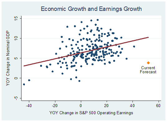
William Hester at Hussmanfunds has an interesting piece on nominal gdp and earnings growth. See chart below with the outlying current forecasts. In spite of the modest expected recovery operating earnigns are supposed to rebound strongly.
How important is the low base?
Is the relationship that strong once we remove the outliers in the bottom left corner?
Which variable is more likely to surprise? Eco on the upside or earnings on the downside?


Sunday, August 16, 2009

Beijing Car Sales

Thanks Paul Kedrosky for the info. 1200 cars sold per day in Beijing so far this year. And the penetration in China remains very low as the following chart from Scotiabank shows.

V-Shape

Here is a chart of YoY change in real GDP.
Since WW2 past episodes of ca -2.5% YoY change in real GDP have all been followed by a strong rebound, hence the usual V-Shape. Double dips are expceptional and muted rebounds inexistent.

Monday, August 3, 2009

Okun's Law Illustrated

Via Brad Delong (x-axis is 8 quarter average annual growth)

Wednesday, July 29, 2009

Recoveries'Look

Via CalculatedRisk I came to this great chart from Macroblog on past recoveries and the forecasts for the current one.


Economists expect a much shallower recovery than the past pattern would suggest. One of the deepest GDP decline followed by one of the smallest post war recovery. Not a great combination but forecasts can still be proven wrong.

Friday, July 24, 2009

Employment and Unemployment Claims

DeLong states: "Payroll Employment Starts Growing When Seasonally-Adjusted Unemployment Claims Fall Below 400K per Week or so..." and he has the chart to prove it.

Monday, July 20, 2009

Crude Oil and Natural Gas

Econbrowser has the explanations and the equations.

"Let Δot denote the monthly percent change in in oil prices (technically, the change in the natural logarithm) and zt the percentage gap in cost (technically, zt = ln(ot/6gt)). If you use a regression to try to predict oil prices from their own lagged values and the lagged oil-gas cost gap, a positive gap such as we have at the moment does tend to tug down future oil prices slightly, though the coefficient is not statistically significant. Here are the regression coefficients, with standard errors in parentheses:
ng_eq1_jul_09.gif

On the other hand, the cost gap does seem to help significantly to predict where natural gas prices might go. With the gap currently at zt = 1.13, the historical regression below might lead you to expect natural gas prices to climb by 10% a month (0.103 x 1.13 = 0.116) until the gap is closed.


ng_eq2_jul_09.gif"

Monday, July 13, 2009

India

H/T Brad De Long for highlighting Martin Wolf's summary of this report on India: An Affluent Society in One Generation.

"So what needs to happen if Indians are to enjoy an affluent lifestyle? The answer, suggests the report, is that India must sustain growth at close to 10 per cent a year over a generation. This is not inconceivable: China has managed that, from a lower base, over three decades. But it is a massive task, particularly for so huge, diverse and complex a country. Extraordinary change would have to occur, inside India and in India’s relationships with the world.

For this to be conceivable, at least four things would have to happen: the world must remain peaceful; the world economy must remain open; India must avoid the stagnation into which many middle-income countries have fallen; and, finally, the resource and environmental implications of its rise to affluence must be managed.

Moreover, India itself must overcome three big challenges: maintaining, indeed strengthening, social cohesion at a time of economic and social upheaval; creating a competitive and innovative economy; and playing a role in its region and the world commensurate with the country’s size and rising importance. In fundamental respects, India must turn itself into a different country.

Not least, as the report makes clear, India would have to be governed quite differently. In India a vigorous, albeit too often corrupt, democratic process has been superimposed on the “mindsets, institutional structures and practices inherited from the British Raj”. India has prospered despite government, not because of it. It is a miracle that the giant has fared as well as it has. But if this country is to prosper it must create infrastructure, provide services, promote competition, protect property and offer justice. The country must move from what the report calls “crony capitalism and petty corruption” to something different. The quality of government, widely believed to be deteriorating, must, instead, radically improve."

Option ARMs - Deja Vu All Over Again?

Thanks Calculated Risk for highlighting this interesting discussion of the following Credit Suisse's chart:


This chart was apparently also used by the IMF:


The IMF chart looks like a great summary of the financial crisis with subprime resets peaking in the second half of 2008 when Lehman et al collapsed. After an "easy" 2009 the resets rise again with a new peak expected at the start of 2011, this time led by options ARMs.
Hence looking at the charts it appears that while subprime loans are slowly leaving the chart a big chunk of option ARM are expected to recast within the next three years. According to the charts these recasts should be over by September 2012. However this apparently does not fit with statements from WFC which does not foresee any major recasts before 2012.

Who's right? Will these recasts have the same impact on the solvency of the financial sectors? And if so when? Over the coming two years or the next five?

CR's conclusion: "this suggests that the problem will persist for some time (much longer than shown by the Credit Suisse chart)."

Healdsburg's conclusion: "The bottom line something doens't add up when Wells Fargo predicts virtually no Option-ARM recasts before 2012, while Credit Suisse predicts no recasts after 2012. While I would guess Wells Fargo is underestimating recasts assuming a flat rate environment, the bulk of recasts do look like they will be pushed out to 2014/2015. Surely, some of these recasts need to be reflected in the Credit Suisse chart. I’ll leave it to others what this means for the housing market, but what is clear is this needs more attention."

My 2 cents: I would go with the banks' statements since they made the loans. Optimistically this could leave them with more time to deal with the problems down the road.

Monday, July 6, 2009

Debt and more debt

Econbrowser has the discussion and the following charts:

First Federal debt held by the public as a % of GDP. Actually not unprecended but let's not repeat the ww2 war effort.


Second a CBO projection of the same ratio under their "alternative fiscal scenario" assuming no changes to current policies. Something has to give.

Sunday, July 5, 2009

Golden Cross

Interesting backtests from Ibankcoin and MarketSci on the validity of being long when the 50 days moving average crosses the 200day ma from below and exit the trade and be in cash when the reverse happens.

Asia's Rise

Thanks InfectiousGreed for highlighting this article from Minxin Pei. The author makes the case that we should not yet buy into the hype of America's decline and Asia's inexorable rise. He tackles the following affirmations:

Power is shifting from the West to the East.
At most the rise of Asia will lead to a multipolar world. For the time being Asia, while producing 30% of world output still live on a 5800US$ GDP per capita. In 08 Asia's combined military spending is still only 1/3 of America's. At current rate of growth it will take 77 years for Asia to reach US GDP per head. Asia is not one entity, expect continuous competition for power. Though dynamic the region can not yet play a role as a thought leader.

Asia's rise is unstoppable
Many hurdles down the road:
Demographic, over 20% of Asian will be elderly by 2050 leading the savings rate to fall
Environmental: pollution, constaints on natural ressources including fresh water could impact agriculture
Economical: with a global slump the export dependent model of development will stop being an engine of growth
Political: rising inequality, corruption, collapsing states, military conflicts all have potential to hinder growth

Asian Capitalism is more dynamic
There is little evidence that Asia's dynamism comes from a certain form of Asian capitalism. Fundamentals play a more important role (high saving, urbanization, low base, regional integration etc.). The following three unique features of Asian capitalism do not help. (1) the state interfers more in the economy (2) State owned companies and family controlled conglomerates dominate the corporate landscape (3) High savings due to poor safety nets

Asia will lead the world in innovation
US still leads in patents 92k in 08 vs 37k for Japan and 8.7k for South Korea. China produces 600000 engineering graduates each year but according to a McKinsey study HR managers consider only 10% and 25% of Chinese and Indian engineers employable compared to 82% for US grads.

Dictatorship has given Asia an advantage
Many countries experienced their fastest growth under undemocratic regimes (Singapore, Indonesia, South Korea, Taiwan and now China. But many autocracies impoverished their countries Burma, Philippines, North Korea, Laos, Cambodia. Furthermore as autocracies became less brutal their economic performance improved. More important than the regime are the appropriate economic policies. In summary: "Dictatorships are good at concealing the problems they create while democracy is good at advertising its defects".

China will dominate Asia
Not that easily as China has its own secession minded minorities covering 30% of its territory. China also has a formidable set of neighbours (Russia, India, Japan) that will not let its power go unchecked.

America is losing influence in Asia
Not according to a recent poll of Asians. Most countries in the region also welcome the US as the guarantor of Asian peace.

Thursday, July 2, 2009

V-Shape?

Econbrowser, as usual, has a very intersting post on inventory restocking. He doubts however that this will be sufficient to witness a strong recovery as "the question is whether our financial system is willing and able to extend the credit that would fuel the recovery. "

Wednesday, July 1, 2009

Wind Energy

"Can wind power get up to speed?" asks time.com

From the article:

Wind power accounted for 42% of all new electricity generation added to the U.S. grid last year

Wind still makes up less than 3% of America's total electricity generation

A new study in the Proceedings of the National Academy of Science (PNAS) found that current technology could harness enough power to supply more than 40 times the planet's present-day levels of electricity consumption.

For the U.S., there's enough wind concentrated in the Midwest prairie states to supply as much as 16 times the current American demand for electricity

The energy is there, on the breeze — it just needs to be tapped.

The problem isn't supply but distribution: in the U.S. and elsewhere, some of the richest wind resources tend to be far from the densely populated coastal areas that need the most electricity.

Another problem is intermittency

Wednesday, June 17, 2009

"A Wall Street Fairy Tale"

Great read from Brad DeLong A Wall Street Fairy Tale

"When American high finance hedged its mortgage risk by buying derivatives from AIG, it did not perform due diligence to figure out if AIG could in fact meet its obligations. This failure cost American high finance an amount that may ultimately reach $300 billion. And it would have been fatal had the government not come to their rescue.

Had the government stepped in by discounting AIG paper in return for warrants and notes at fair market values, the banks' life support apparatus would have been obvious. It is only because the government stepped in by nationalizing AIG and guaranteeing its debts that American high finance now has healthy stock prices, and that the senior executives of the big banks—except Citi, Bank of America, Lehman, and Bear-Stearns—are congratulating themselves for their skillful navigation through the crisis."

Sunday, June 14, 2009

A Simple Asset Allocation

Zerohedge has an interesting post on asset allocation: A common Sense Guide to Investing. The following table is helpful.

Weird Stuff Going on in Natural Gas ETF

Excellent little summary of the issues surrounding commodities etfs from FT Alphaville.

Friday, June 12, 2009

Back to Normal

Brad DeLong informs us: TED spread is back to normal, pre-crisis level.

Thursday, June 11, 2009

China and the World

Econbrowser has the charts:

At PPP:


In current dollars:

Saturday, June 6, 2009

"The Relationship Between Crude Oil and Natural Gas Prices"

43 pages added to the pile!

Natural Gas Prices are here

Crude Prices are here and they moved up strongly while nat gas are lagging.

Summary from above paper p. 40f:
"Economic theory suggests that there is a relation between natural gas and oil prices, but the influence of an increase in oil prices may conflict in its effects on natural gas supply, and therefore, prices. Production of natural gas may increase as a co-product of oil, or may decrease as a result of higher-cost productive resources. While the net effect of an increase in oil prices on natural gas supply may be ambiguous, the effect on natural gas demand is clear, resulting in a positive relation between oil and natural gas prices. Given the relative inelasticity of natural gas supply in the short term owing to factors such as a 12-18 month lag in the production response to drilling changes, it appears that the effect of oil prices on natural gas demand is dominant in the short run.
...
The analysis supports the presence of a cointegrating relationship between the crude oil and natural gas price time series, providing significant statistical evidence that WTI crude oil and Henry Hub natural gas prices have a long-run cointegrating relationship. A key finding of the analysis is that natural gas and crude oil prices historically have had a stable relationship, despite periods where they may have appeared to decouple.
...
The estimation of the model resulted in identifying evidence of a stable relationship between natural gas and crude oil prices. The statistical evidence also supported the a priori expectation that while oil prices may influence the natural gas price, the impact of natural gas prices on the oil price is negligible. With crude oil prices weakly exogenous to natural gas prices, the short-run response of the natural gas price to contemporaneous changes in the oil price was found to be statistically significant."

Monday, June 1, 2009

World Electricty Consumption

Via Paul Kedrosky an other consequence of the global recession: world electricity consumption expected to decline yoy for the first time since WWII.

Saturday, May 23, 2009

Three Charts on Inflation

First Annual Inflation and Capacity Utilization:


Then Monetary Base and CPI 1982 to 2008


Finally the same from 1982 to 2009. What kind of impact will this hockey stick have on the price level?

Thursday, May 21, 2009

Recession Haiku

Via CrossingWallstreet a fun challenge, here is mine:
What grew GDP?
Too much leverage and some
Now it's over, save!

Deleveraging

Great little paper from the San Francisco Fed on consumer deleveraging.

Taking Japan as an example the process may take 10 years till 2018 to bring back household debt to personal income to 100%, the level of 2002, from the excessive 133% reached in 2007.

Their conclusion: "A simple model of household debt dynamics can be used to project the path of the saving rate that is needed to push the debt-to-income ratio down to 100% over the next 10 years—a Japan-style deleveraging. Assuming an effective nominal interest rate on existing household debt of 7%, a future nominal growth rate of disposable income of 5%, and that 80% of future saving is used for debt repayment, the household saving rate would need to rise from around 4% currently to 10% by the end of 2018. A rise in the saving rate of this magnitude would subtract about three-fourths of a percentage point from annual consumption growth each year, relative to a baseline scenario in which the saving rate did not change."