
Thursday, April 30, 2009
Great Back to Back Months - What's Next?
April is over and it was a great month for the S&P500 (the second in a row!) with the index closing up 9.4% after up 8.5% in March. This is the best two months streak since 1950. Since then we've had only three two months periods with the S&P up more than 15%. Here is a look at how the market fared after such episodes. (indexed to 100 just before the 2 months streak!)

Wednesday, April 29, 2009
Pakistan
Thanks to Brad de Long for highlighting this somewhat reassuring article on Pakistan. The author's conclusion: "The hype about Pakistan is very sinister and mysterious and makes no sense to someone who actually knows the country."
The article refers to that post from Harvard prof Stephan M. Walt which asks three questions about Pakistan: "1. First, why is there so much disagreement about Pakistan's prospects among knowledgeable experts? 2. Will India Help? 3. The Big Question: What is the best way to protect Pakistan's nuclear arsenal?"
Added note: good briefing in the economist "A real offensive, or a phoney war?"
Tuesday, April 28, 2009
"The Color of China"
A tad long but still a very insightful exchange on China's prospects between Minxin Pei and Jonathan Anderson in the March 09 issue of the National Interest.
Pei argues for looming stagnation citing a number of issues such as China's ageing population, the resulting decrease in savings, increasing social costs, rising environmental problems and inequality.
Anderson on the other hand has a more optimistic view. In his case for Beijing's exceptionalism he first sums up the country's achievement: "in strict macroeconomic terms, so far China is unambiguously the most successful emerging economy of the postwar era. And at the current pace of development, China’s “rise” is not some hazy prospect shimmering on the distant horizon, but a concrete reality only twenty years down the road." He notes that roughly a third of Chinese growth came from factor productivity and that the corporate sector (SOE or purely private) has shown increasing margins in the past 15 years. This bodes well for savings and investments going forward. He explains that there is not much "state" left in SOEs as many sectors are truly competitive in spite of state ownerhips (many automakers, airlines, utilities, telcos etc.). Overall SOEs which still represent ca 25% of GDP are as exposed to market forces as kleiretsu in Japan and chaebol in Korea were if not more. Hence worries about missallocation of capital by an inefficient State are overstated. As for ageing Anderson notes that China has 73m underemployed people in the countryside which will help alleviate the issue.
His conclusion: "The bottom line is that China has seen considerable structural and largely market-driven changes that are already fundamentally altering the rural income balance, and should go a long way toward addressing the economic problems leading to the recent unrest. This year and the next will be tough, to be sure, as weak export markets and, especially, falling construction demand take a toll on migrant employment—but as I argued above, these are cyclical issues that are unlikely to prevent a return to trend growth in the near future and over the long term."
Monday, April 27, 2009
IMF on Climate Change
Browsing through their website I found this chapter from last year's WEO. Added to the pile!
IMF - Global Financial Stability Report
New estimates of global credit losses: 4.1tn US$
See page 48ff of the pdf report.
"As a result of continued pressures in credit markets, global financial institutions and other holders could face larger potential writedowns, according to our estimates (Table 1.3). Looking at the range of assets originated in the United States over the same cumulative period (2007–10) as in prior GFSRs, expected writedowns have risen to some $2.7 trillion, up from the $2.2 trillion estimated at our interim update in January 2009, and from the $1.4 trillion estimated in October 2008. The rise represents the credit deterioration that the worsening economic cycle is creating (Figure 1.27). Considering a much wider set of outstanding loans and securities to include European-originated loans and related securities as well as Japanese-originated assets (totaling some $58 trillion compared to earlier estimates based on $27 trillion of U.S. originated loans and securities) provides a broader, albeit more uncertain, assessment of potential writedowns of some $4.1 trillion. While banks are expected to bear about two-thirds of the writedowns, other financial institutions including pension funds and insurance companies also have significant credit exposures. Among other market participants, hedge funds have suffered losses related to both mark-to-market declines and forced asset liquidations due to redemptions."
Saturday, April 25, 2009
China: Electricity Consumption and GDP growth
Floyd Norris posts the China's year-over-year increases in its gross domestic product and electricity consumption for the first quarter of each year.
2002: Electricity up 9.4%, G.D.P. up 8%
2003: Electricity up 14.7%, G.D.P. up 10.3%
2004: Electricity up 16.7%, G.D.P. up 9.8%
2005: Electricity up 14.3%, G.D.P. up 9.9%
2006: Electricity up 13.4%, G.D.P. up 10.4%
2007: Electricity up 12.4%, G.D.P. up 11.7%
2008: Electricity up 16%, G.D.P. up 10.6%
China Q1'09 GDP was up 6.1% YoY while in the first two months of the year electricity consumption was down over 9% from last year.
This reminds me of this story of provinces overstating their GDP estimates.
Thursday, April 23, 2009
Wind Energy
H/T Paul Kedrosky for pointing out this piece on wind energy. This chart is impressive comparing the current wind energy development to the beginning of the nuclear era.

Rainfall and GDP growth
From the economist's dailychart. Variability in rainfall explains why economies dependent on farming have more volatile gdp's. As the paper notes it seems however that some changes in GDP precede the ones in rainfalls. An other example of Cum Hoc Ergo Propter Hoc?

Saturday, April 18, 2009
Current Recession vs Past
Via Econbrowser a chart from IMF's latest World Economic Oulook. Two factors make the current US recession particularly tough: "(1) recessions are longer and deeper when associated with financial crises, and (2) recessions are longer and deeper when the downturns are synchronized with recessions abroad."

Friday, April 17, 2009
Corporate Profits to GDP Ratio
Via Zerohedge a chart of corporate profit to GDP ratio.
ZH then posts this comment: "Look at the nearby chart, which presents National Account profits relative to GDP – a proxy for margins. People who look at the earnings plunge and deem this to have been the worst setback ever and note how we have broken all the peak-totrough declines in the past fail to take into account the starting point – the profit-to- GDP ratio at the 2006 peak hit an all-time high of 10.9% – not once did it ever even cross above the 10% threshold in the 60-year history of the data. A normal peak was typically around 7%, and today it is 6.6% – after the sharp slide this cycle, it is actually close to prior bull market peaks, believe it or not. The average recession trough is 4.6%, so on that basis we are basically two-thirds of the way though the margin compression phase and seeing as we think nominal growth is likely to be flat over the next two years, a complete normalization of this ratio would imply a further 30% downside potential for corporate profits. Applying that to S&P 500 operating earnings would actually put them at risk of bottoming at $35 at some point over the next two years, which in turn means we have a forward multiple of very close to 25x, which is simply too rich for our liking."
ZH then posts this comment: "Look at the nearby chart, which presents National Account profits relative to GDP – a proxy for margins. People who look at the earnings plunge and deem this to have been the worst setback ever and note how we have broken all the peak-totrough declines in the past fail to take into account the starting point – the profit-to- GDP ratio at the 2006 peak hit an all-time high of 10.9% – not once did it ever even cross above the 10% threshold in the 60-year history of the data. A normal peak was typically around 7%, and today it is 6.6% – after the sharp slide this cycle, it is actually close to prior bull market peaks, believe it or not. The average recession trough is 4.6%, so on that basis we are basically two-thirds of the way though the margin compression phase and seeing as we think nominal growth is likely to be flat over the next two years, a complete normalization of this ratio would imply a further 30% downside potential for corporate profits. Applying that to S&P 500 operating earnings would actually put them at risk of bottoming at $35 at some point over the next two years, which in turn means we have a forward multiple of very close to 25x, which is simply too rich for our liking."
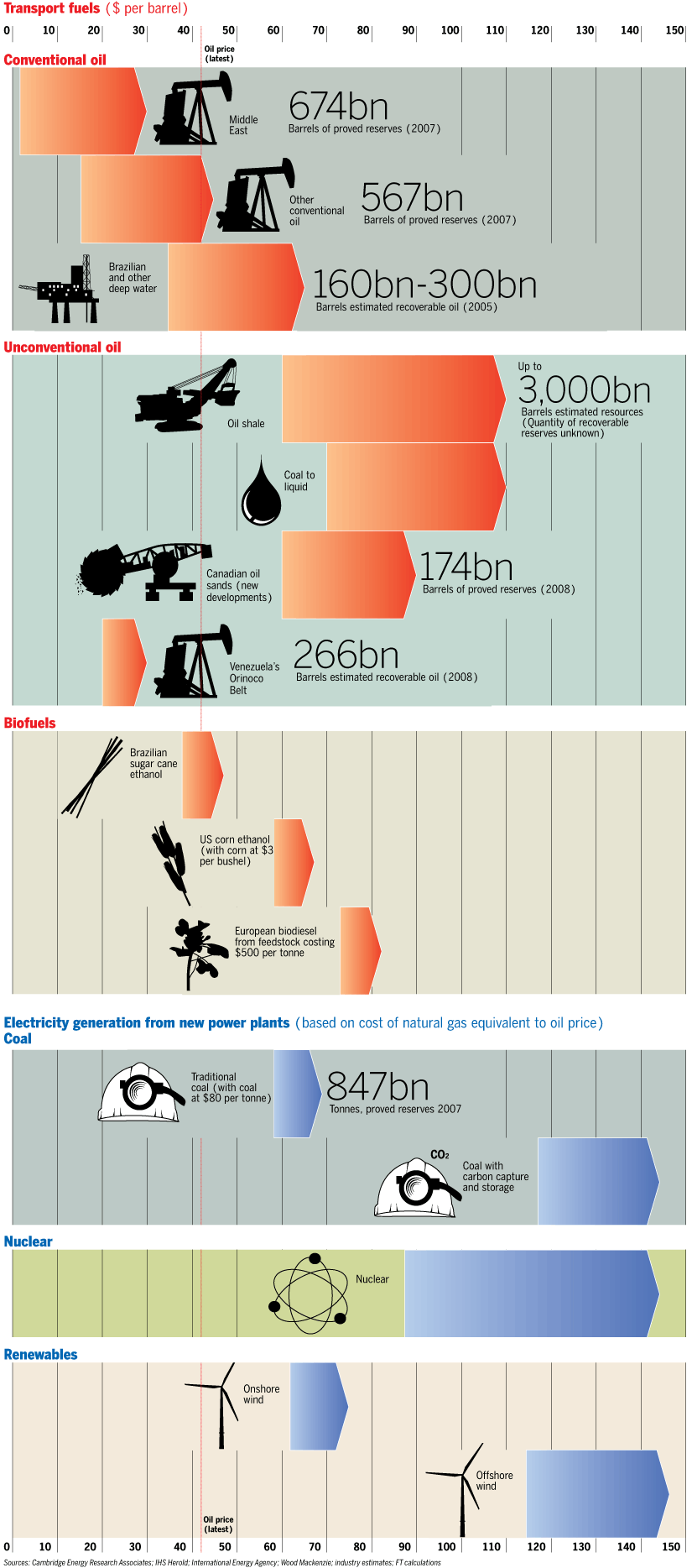
Oil Price Points
Tuesday, April 14, 2009
"The Capitalism Distribution"
The following charts apparently appear in Meb Faber's new book the Ivy Portfolio. (h/t designing better futures who refers to a study done by Blackstar funds)

The study looks at individual stock returns from 1983 to 2007. Over this long time period 25% of the stocks were responsible for all of the gains.

Here are Blackstar Funds' interesting conclusions (my highlights in bold):
"39% of stocks had a negative lifetime total return (2 out of every 5 stocks are a money losing investment)
18.5% of stocks lost at least 75% of their value (Nearly 1 out of every 5 stocks is a really bad investment)
64% of stocks underperformed the Russell 3000 during their lifetime (Most stocks can’t keep up with a diversified index)
A small minority of stocks significantly outperformed their peers (Capitalism yields a minority of big winners that all have something in common)"
The study looks at individual stock returns from 1983 to 2007. Over this long time period 25% of the stocks were responsible for all of the gains.
Here are Blackstar Funds' interesting conclusions (my highlights in bold):
"39% of stocks had a negative lifetime total return (2 out of every 5 stocks are a money losing investment)
18.5% of stocks lost at least 75% of their value (Nearly 1 out of every 5 stocks is a really bad investment)
64% of stocks underperformed the Russell 3000 during their lifetime (Most stocks can’t keep up with a diversified index)
A small minority of stocks significantly outperformed their peers (Capitalism yields a minority of big winners that all have something in common)"
Friday, April 10, 2009
Changes in Unemployment Rate and Recessions
We saw in the previous post that the unemployment rate is a lagging indicator as it usually peaks after recessions end.
The YoY change in the unemployment rate is less lagging. In 5 of the past 10 recessions it peaked as the recessions was still officially ongoing. On average the YoY change in unemployment peaked 4 months ahead of the unemployment rate itself. The YoY change in unemployment peaked earlier than the unemployment rate in 6 of the past 10 recessions while on four occasions both numbers peaked the same month.
See this chart. Now I know how to highlight recessions in charts. Nice!

Added note: econbrowser looks at 4 week average initial unemployment claims and the end of recessions and concludes: "If subsequent data confirm that the 4-week average of initial claims did indeed reach its peak in the number reported April 2, and if Gordon's pattern holds up, the recovery that many of us had assumed would be quarters or perhaps even years away may instead have started by June"
Wednesday, April 8, 2009
Unemployment is a Lagging Indicator
Using the St Louis Fed charting tool:

Since 1948 in 9 out of 10 past recessions the unemployment rate peaked after the recession ended and more so for the more recent ones.
Since 1948 in 9 out of 10 past recessions the unemployment rate peaked after the recession ended and more so for the more recent ones.
Tuesday, April 7, 2009
Current Recession vs Great Depression
Via Paul Krugman Barry Eichengreen and Kevin O'ROurke compare the current recession to the great depression. Compared to this opinion here and Paul Krugman here they seem much less optimistic. "Often cited comparisons – which look only at the US – find that today’s crisis is milder than the Great Depression. In this column, two leading economic historians show that the world economy is now plummeting in a Great-Depression-like manner. Indeed, world industrial production, trade, and stock markets are diving faster now than during 1929-30. Fortunately, the policy response to date is much better."
Figure 1. World Industrial Output, Now vs Then

Figure 3. The Volume of World Trade, Now vs Then
Their conclusion: "To summarise: the world is currently undergoing an economic shock every bit as big as the Great Depression shock of 1929-30. Looking just at the US leads one to overlook how alarming the current situation is even in comparison with 1929-30.
Figure 1. World Industrial Output, Now vs Then
Figure 3. The Volume of World Trade, Now vs Then
Their conclusion: "To summarise: the world is currently undergoing an economic shock every bit as big as the Great Depression shock of 1929-30. Looking just at the US leads one to overlook how alarming the current situation is even in comparison with 1929-30.
The good news, of course, is that the policy response is very different. The question now is whether that policy response will work. For the answer, stay tuned for our next column."
Sunday, April 5, 2009
Current Recession vs Great Depression
Francis J. Gavin on McKinsey's What Matters (h/t infectiousgreed) compares the current mess to the great depression. He is somewhat reassuring: "The magnitude of the Great Depression was unprecedented and unlikely to be repeated—the unemployment rate in the United States reached 25 percent, home foreclosures were an order of magnitude larger, and the gross domestic product fell by almost half between 1929 and 1933. Furthermore, our economic policymakers and politicians have not repeated the disastrous policies of the past, which included raising interest rates and hiking trade barriers."
His comments on the political backdrop of the great depression are also worth noting: "But the key differences between the current crisis and the past are less economic than political. The Great Depression was the offspring of the killing fields of Europe: the First World War had destroyed trading patterns, undermined currencies, and produced massive public debts. Who would foot the bill for this catastrophe? The Americans had financed the British and French victories, and expected to be paid back in full. The British and French demanded that Germany carry the cost by paying reparations. Germany —which been victorious on their Eastern front and had prevented Allied forces from entering their territory—had agreed to end the war in part because of Woodrow Wilson’s promise not to impose a victor’s peace. When this promise was broken and massive reparations were imposed, a bitter decade-long battle over who would pay what ensued. From this toxic environment of distrust and enmity emerged a series of unsustainable deals, whereby America financed Germany’s reparations to Britain and France, which were recycled back to the United States in the form of war debt payments. If American financing dried up – which it did during the late 1920s—the whole scheme would collapse, taking the international monetary system with it."
He then concludes: "There are valuable lessons from history that can be applied to policy today. But we should keep in mind we also have important advantages our forebearers did not. Most fortunately, we live in an era when the threat of a great power war in the developed world is remote. The major players may have their political differences, but nothing approaching the bitterness and distrust that marked international relations in the last century. In addition, the greater interconnectedness of the world that has grown up over the past 20 years will act as a counterweight to the tendency to pursue purely self-interested policies. This backdrop will make continued cooperation much easier, and should make another Great Depression far less likely."
Friday, April 3, 2009
Sovereign Bond Ratings over Time
From the Economist:

Ratings have deteriorated but this is because many countries have gained access to international debt markets. As the economist explains: "Last year there were 108 sovereign issuers; in 1983 there were only 14, all investment grade. By 1995 the proportion of issuers with investment grades had slipped to 78% and the share with Moody’s top mark, Aaa, had fallen from three-quarters to one-fifth."
Ratings have deteriorated but this is because many countries have gained access to international debt markets. As the economist explains: "Last year there were 108 sovereign issuers; in 1983 there were only 14, all investment grade. By 1995 the proportion of issuers with investment grades had slipped to 78% and the share with Moody’s top mark, Aaa, had fallen from three-quarters to one-fifth."
"Causes of the Oil Shock of 2007-08"
Prof Hamilton at Econbrowser comments on his latest paper on the oil shock of 07-08. He notes that while world GDP and oil demand grew strongly from 03 to 07 world oil production stagnated between 05 and 07 and hence the price of oil had to increase to persuade some to curb consumption.
He then explains: "It seems reasonable to maintain that the economic growth in 2006 and 2007 would have resulted in at least as big a shift of the demand curve as resulted from the slightly weaker GDP growth of 2004 and 2005. Adding in the first half of 2008 (when global GDP continued to rise), consider then the consequences of a rightward shift of the demand curve of 5.5 million barrels per day. With production only increasing by 0.5 mb/d over this period, a demand elasticity of ε = 0.06 would imply that the price should have risen from $55/barrel in 2005 to $142/barrel in 2008:H1. 

He then explains: "It seems reasonable to maintain that the economic growth in 2006 and 2007 would have resulted in at least as big a shift of the demand curve as resulted from the slightly weaker GDP growth of 2004 and 2005. Adding in the first half of 2008 (when global GDP continued to rise), consider then the consequences of a rightward shift of the demand curve of 5.5 million barrels per day. With production only increasing by 0.5 mb/d over this period, a demand elasticity of ε = 0.06 would imply that the price should have risen from $55/barrel in 2005 to $142/barrel in 2008:H1.
"But why then did the price subsequently collapse even more dramatically? A shift of the demand curve back to the left as a result of the impressive global economic downturn is certainly part of the answer. Note, however, that even if global real GDP were to fall by more than 10%-- which so far fortunately it has not-- that would only put us back to where we were in 2005 (at $55 a barrel), and the price was observed to fall even more than this. We therefore would need to postulate a second factor behind the price decline of 2008:H2, namely, an increase in the price elasticity of demand as consumers had time to make adjustments. Again such a hypothesis is consistent with previous experience, and in particular, between 2007:Q3 and 2008:Q3, U.S. petroleum consumption fell by 8.8%. That drop in U.S. petroleum consumption unambiguously represented the combined effects of lower income and price-induced changes in use.
If we say that one elasticity (0.06) is to be used to account for the 2008:H1 price and another higher elasticity for 2008:H2, there is an implicit claim that market participants were learning imperfectly about the price elasticity of demand. There was a surprisingly long period in which demand responded less than some might have expected to the oil price increases (i.e., consistent with an elasticity of 0.06), and then a very dramatic drop in oil use as a result of the combined influence of falling incomes and changing consumption habits."
But where are the speculators?
Employment Situation - bottomed?
Edward Harrison guestblogging at Nakedcapitalism first asks "Are Jobless Claims Peaking?". He looks the YoY change in the unadjusted 4-week average of initial jobless claims

and makes the following observation:
"As you can see, the graph clearly indicates that the change in initial jobless claims has peaked (temporarily?). These peaks are not lagging indicators, they are usually coincident or leading indicators. Here are the dates and numbers for peaks in changes in initial claims going back to 1967 when the data began:
With a nice 25% rally from the bottom the stock market seems to concur.
However after the latest release from the BLS on the employment situation he loses some of his optimism noting: "My favorite employment related-statistic, the year-on-year change in the unemployment rate, is a coincident or leading indicator. It is still rising. The SA change is 3.5%, up from 3.2% in February. The real NSA number is 3.8% up from 3.7%. As a point of reference, the worst climb since the depression is 4.2% in October 1949. I would expect that is where we are headed. (In 1932 this number reached 10.7% and in 1938 it reached 8.6%)."
He then looks at this chart

and writes: "The gray bars above indicate recessions. What you should notice above is that recessions don't end until the change in the unemployment rate peaks. Whether we peak late this year is a matter of pure speculation at this point. The long and short: the employment situation report paints a grim picture and it is getting worse."
Is the market too optimisitic after all?
and makes the following observation:
"As you can see, the graph clearly indicates that the change in initial jobless claims has peaked (temporarily?). These peaks are not lagging indicators, they are usually coincident or leading indicators. Here are the dates and numbers for peaks in changes in initial claims going back to 1967 when the data began:
- 5 December 1970 at 120,000 (the recession ended in November 1970)
- 1 Feb 1975 at 361,000 (the recession ended in March 1975. Note: Apr-Jun 1974 showed positive GDP growth)
- 7 Jun 1980 at 238,000 (the recession ended in July 1980. Note: this was the first in a double dip recession)
- 30 Jan 1982 at 202,000 (the recession ended in November 1982. Note: Apr-Jun 1982 showed positive GDP growth)
- 23 Mar 1991 at 154,000 (the recession ended in March 1991)
- 20 Oct 2001 at 165,000 (the recession ended in November 2001
With a nice 25% rally from the bottom the stock market seems to concur.
However after the latest release from the BLS on the employment situation he loses some of his optimism noting: "My favorite employment related-statistic, the year-on-year change in the unemployment rate, is a coincident or leading indicator. It is still rising. The SA change is 3.5%, up from 3.2% in February. The real NSA number is 3.8% up from 3.7%. As a point of reference, the worst climb since the depression is 4.2% in October 1949. I would expect that is where we are headed. (In 1932 this number reached 10.7% and in 1938 it reached 8.6%)."
He then looks at this chart
and writes: "The gray bars above indicate recessions. What you should notice above is that recessions don't end until the change in the unemployment rate peaks. Whether we peak late this year is a matter of pure speculation at this point. The long and short: the employment situation report paints a grim picture and it is getting worse."
Is the market too optimisitic after all?
Wednesday, April 1, 2009
New Home Sales as a % of US Population
February New Home sales increased slightly MoM from an all time low annual sales rate of 322k in January 2009 to 337k. This is still slightly below the previous record low of 338k annual sales rate reached in September 81. Since 81 however the US population has increased from 230m to ca 306m in Feb 09. As a % of US population the current new home sales are truly making new lows as the following chart illustrates.

Population increases and household formation should eventually drive new home sales higher. The US population grows by ca 200k people each month vs monthly new home sales of 27k in February 2009
.

Population increases and household formation should eventually drive new home sales higher. The US population grows by ca 200k people each month vs monthly new home sales of 27k in February 2009
.

Subscribe to:
Posts (Atom)

